Echogen
Building the systems that power what’s next.
A strategy built for credibility and scale.
Echogen’s technology is rewriting the rules of energy—not in theory, but in the workshop. For nearly two decades, their team has advanced supercritical CO₂ (sCO₂) technology from concept to reality—developing systems that store power, cut industrial emissions, and transform waste heat into new energy. But while their engineering was proven, their brand wasn’t keeping pace. Antenna partnered with Echogen to craft a brand that reflects their character: precision without pretense, engineering with imagination. These aren’t theorists—they’re builders, thinkers, and tinkerers who make innovation tangible—and that hands-on ethos drove the work. The result is a visual and verbal system that communicates intelligence, integrity, and real progress, built from the ground up.
From complexity to clarity.
Echogen’s legacy of innovation demanded a brand that could speak to both technical and commercial audiences without oversimplifying the science. Antenna developed a unified brand architecture and narrative framework that positioned Echogen’s three technology pillars—Energy Storage, Industrial Decarbonization, and Heat-to-Power—within one coherent story. The new identity balances visual restraint and technical depth, showcasing Echogen’s confidence through structure, typography, and clarity of information. The copy speaks fluent thermodynamics—clear enough for anyone to get it, sharp enough for engineers to respect it.


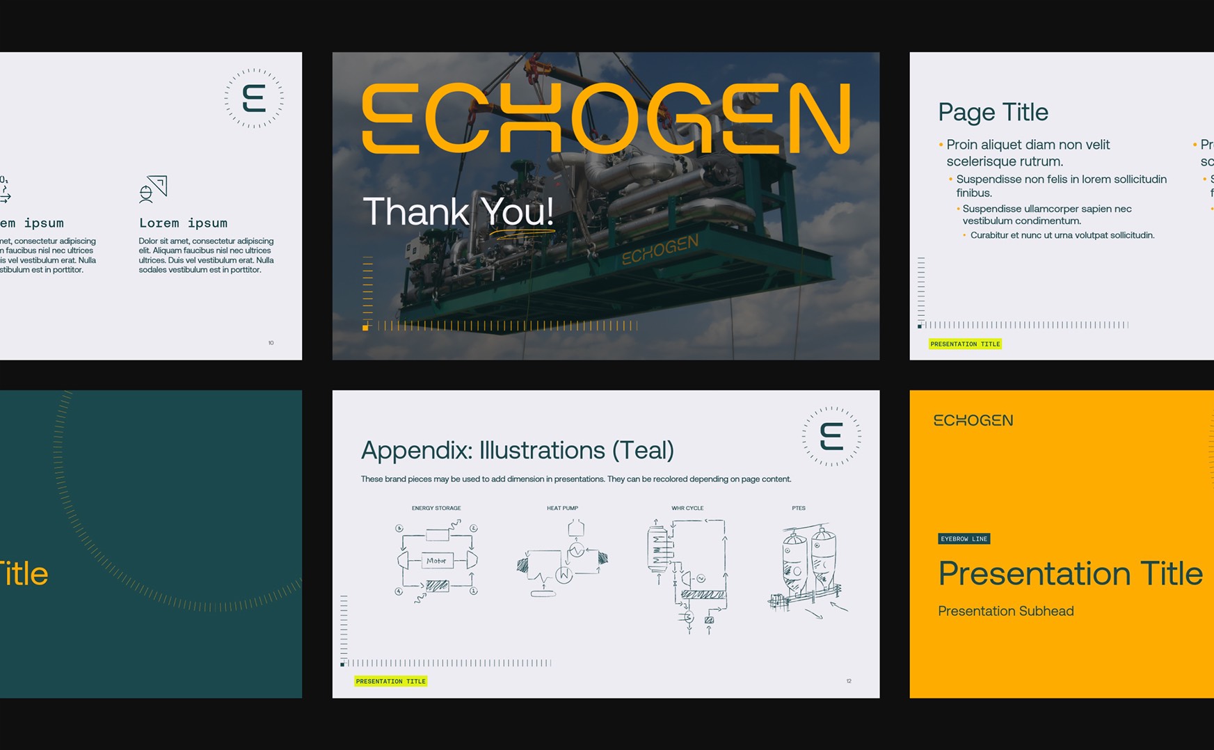
A design where precision meets play.
Antenna’s creative direction translated Echogen’s engineering ethos into a design system built on three complementary principles—Workmanlike Resolve, Brainiac Workflow, and a Sense of Play. Together, they shape an identity that’s as disciplined as it is dynamic. Candid photography and strong, industrial-grade typography ground the brand in reality, capturing the grit, capability, and confidence of real engineering work. Technical precision comes through in schematic linework, monospaced type, and modular iconography that echo the logic of design and measurement. And running through it all is a sense of play—hand-drawn loops, annotations, and gestural marks that bring warmth and movement, reflecting Echogen’s hands-on curiosity and unapologetically practical spirit.
The result is a brand that feels real, and also refined—built with precision, but not precious. It celebrates the work as much as the outcome: human, focused, and unmistakably made by people who get their hands dirty to build what lasts.


Defining a voice that builds trust.
Echogen’s voice mirrors its engineering ethos—direct, confident, and rooted in proof. The tone flexes across audiences: technical depth for industry partners, approachable clarity for policymakers and investors. Phrases like “Built, tested, and delivered” and “We don’t chase the future, we engineer it” capture the discipline and realism that define Echogen’s way of working—authentic, grounded, and proud of results earned through validation.

Phase 1—Discovery & strategy
This was more than discovery—it was uncovering who Echogen truly is. Through interviews and audits, we identified a rare blend of hands-on engineering expertise and proven sCO₂ systems that scale. What stood out most was their personality: pragmatic, grounded, and human. These are salt-of-the-earth engineers who solve hard problems with grit and curiosity. Our strategy: build a brand that mirrors that mindset—credible, capable, and fueled by a sense of play.
Phase 2—Brand Identity & Expression
We translated Echogen’s hands-on pragmatism into a unified visual and verbal identity. Bold typography, clean geometry, and an industrial-inspired palette convey precision and strength, while expressive gestures introduce warmth and movement. Every element feels intentional yet human—structured for performance, energized by creativity. The result: a brand engineered with purpose and personality.
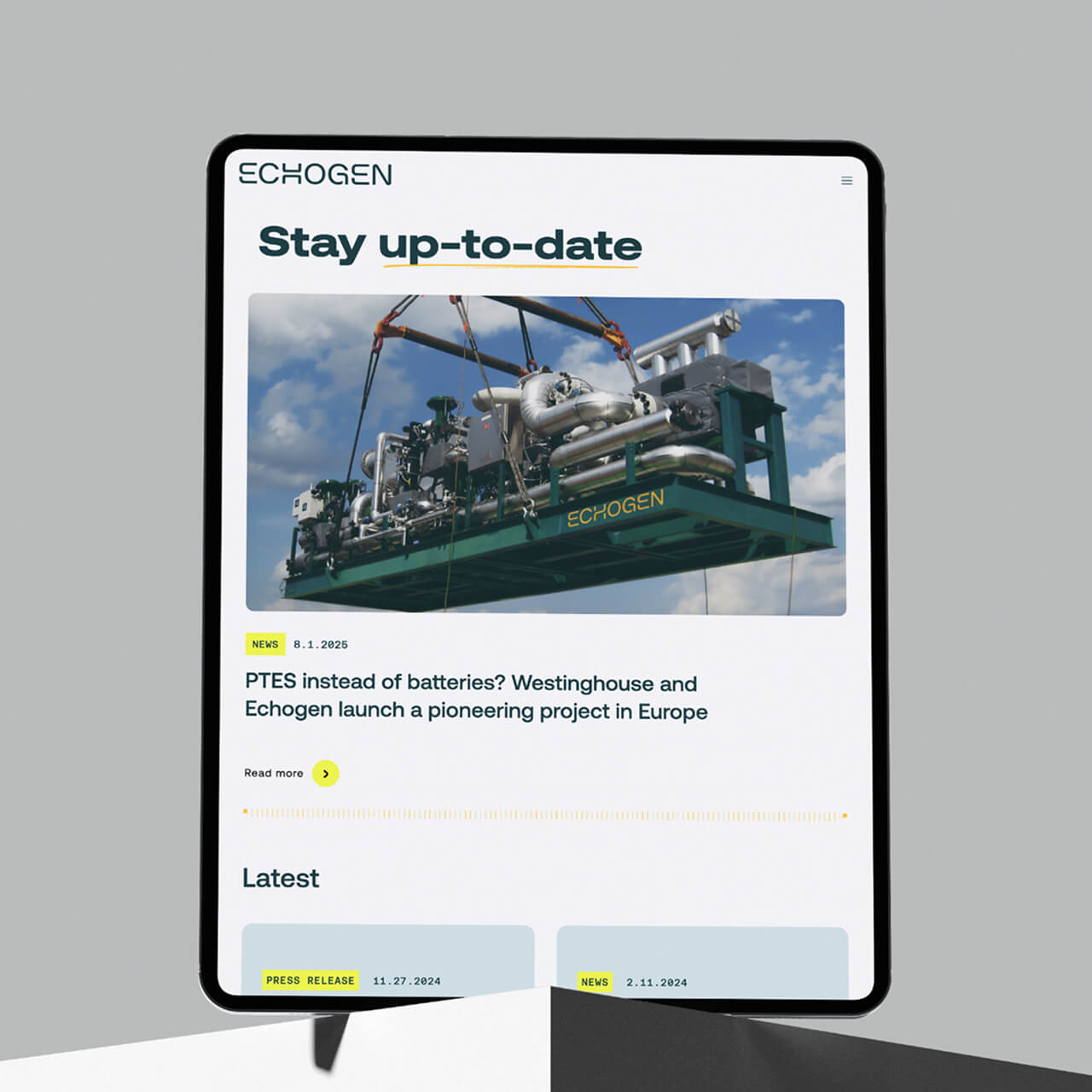
Phase 3—Digital Presence & Content System
We extended the brand into a digital ecosystem built for clarity and confidence. Each page—Energy Storage, Industrial Decarbonization, and Heat-to-Power—follows a consistent story from challenge to proof. A clean, intuitive UI design mirrors Echogen’s no-nonsense approach, guiding users through complex ideas with ease. The outcome is a scalable, accessible platform that delivers clarity without compromise.

A platform for what’s next.
Echogen now has a brand that feels as real and resilient as the technology behind it. The new system unites internal teams and external communications under one clear idea: built, tested, and proven. By merging clarity with craft—precision with personality—the brand captures the ingenuity, grit, and playfulness that define Echogen’s way of working. The result is a cohesive identity built for what’s next in energy: real engineering, realized.
Credits